الثلاثاء، 20 نوفمبر 2012

كيفية اضافة تأثير جميل على التسميات في بلوجر بـCSS


http://i.imgur.com/Swt8f.png
السلام عليكم ورحمة الله وبركاته.
 
كيفكم؟؟
 
يسرني ان اقدم لكم  شرح لكيفية اضافة تأثير على التسميات في المدونة
بحيث عند تحريك المؤشر فوق اسم اي قسم يحدث له التأثير كما في الصوره اعلاه
 
طبعا تم ترجمة الموضوع من قِبل مدونة ارشيف بلوجر ,المصدر 
فارجو ان تنال الاضافة اعجابكم الان مع كيفية التركيب.
  1. اذهب للوحة تحكم مدونتك .
  2. القالب.
  3. تحرير HTML'
  4. متابعه و اشر على توسيع القوالب.
  5. اضغط Ctrl+F من لوحة المفاتيح.
  6. ابحث عن الوسم التالي:
  ]]></b:skin>
7. قم بلصق الكود التالي اسفله مباشره:
/*-----Custom Labels Cloud widget by www.blogger-archive.com----*/
.label-size{
margin:0 2px 6px 0;
padding: 3px;
text-transform: uppercase;
border: solid 1px #C6C6C6;
border-radius: 3px;
float:left;
text-decoration:none;font-size:10px;color:#666;}

.label-size:hover {
border:1px solid #6BB5FF;
text-decoration: none;-moz-transition: all 0.5s ease-out;
-o-transition: all 0.5s ease-out;
-webkit-transition: all 0.5s ease-out;
-ms-transition: all 0.5s ease-out;
transition: all 0.5s ease-out;
-moz-transform: rotate(7deg);
-o-transform: rotate(7deg);
-webkit-transform: rotate(7deg);
-ms-transform: rotate(7deg);
transform: rotate(7deg);
filter: progid:DXImageTransform.Microsoft.Matrix(
M11=0.9961946980917455, M12=-0.08715574274765817, M21=0.08715574274765817, M22=0.9961946980917455, sizingMethod='auto expand');
zoom: 1;
}
.label-size a {
text-transform: uppercase;
float:left;
text-decoration: none;
}.label-size a:hover {
text-decoration: none;
}
 الان اضغط حفظ.
 
 
اخيرا ارجو ان يستفيد الجميع من الموضوع
و اي استفسار يمكنك وضعه في تعليق
وساقوم بالاجابه عنه في اقرب وقت
ممكن ان شاء الله.
تحيااتي.

ازرار المواقع الاجتماعية عائمة بشكل جميل جدا جنب الصفحه

http://i.imgur.com/bDHkD.png 

السلام عليكم ورحمة الله وبركاته.

ها نحن اليوم مرة اخرى مع اضافة جديده ومميزه للمدونات وهي عبارة

شريط عائم جنب المدونة يحوي ازرار المواقع الاجتماعيه  بشكل جميل ورائع

اضافة جميله تم ترجمة الموضوع من قِبل مدونة ارشيف بلوجر ,المصدر 

فارجو ان تنال الاضافة اعجابكم الان مع كيفية التركيب.

  1. اذهب للوحة تحكم مدونتك .
  2. القالب.
  3. تحرير HTML'
  4. متابعه و اشر على توسيع القوالب.
  5. اضغط Ctrl+F من لوحة المفاتيح.
  6. ابحث عن الوسم التالي:
  ]]></b:skin>

7. قم بلصق الكود التالي فوقه مباشره:

/* The CSS Code for the menu starts here http://www.blogger-archive.com/ */
/* CoolDoood Social Network Tabs */
.MBC ul, .MBC li, .MBC h3 {
padding: 0;
margin: 0;
list-style: none!important;
}
.MBC {
font-size: 12px;
color: #666;
}
.active.MBC .mbc-slider {
-webkit-box-shadow: 0 0 4px 1px rgba(0, 0, 0, 0.6);
-moz-box-shadow: 0 0 4px 1px rgba(0, 0, 0, 0.6);
box-shadow: 0 0 4px 1px rgba(0, 0, 0, 0.6);
}
.MBC a {
text-decoration:none;
}
.MBC-content {
position: relative;
}
.social-tabs li {
padding: 4px;
width: 27px;
height: 26px;
z-index: 10;
}
.active .social-tabs li {
z-index: 10;
-webkit-box-shadow: 0 0 2px 0 rgba(0, 0, 0, 0.6);
-moz-box-shadow: 0 0 2px 0 rgba(0, 0, 0, 0.6);
box-shadow: 0 0 2px 0 rgba(0, 0, 0, 0.6);
}
.active .social-tabs li.active {
z-index: 11;
-webkit-box-shadow: 0 0 4px 1px rgba(0, 0, 0, 0.6);
-moz-box-shadow: 0 0 4px 1px rgba(0, 0, 0, 0.6);
box-shadow: 0 0 4px 1px rgba(0, 0, 0, 0.6);
}
.static .social-tabs {
padding-left: 8px;
}
.static .social-tabs li {
float: left;
margin-right: 2px;
border-radius: 5px 5px 0 0;
-webkit-border-radius: 5px 5px 0 0;
-moz-border-radius: 5px 5px 0 0;
}
.top .social-tabs {
padding-left: 8px;
}
.top.align-right .social-tabs {
padding-left: 0;
padding-right: 8px;
}
.top .social-tabs li {
padding: 3px 4px;
margin-right: 2px;
float: left;
border-radius: 0 0 5px 5px;
-webkit-border-radius: 0 0 5px 5px;
-moz-border-radius: 0 0 5px 5px;
}
.right .social-tabs {
padding-top: 8px;
}
.right .social-tabs li {
margin: 0 0 2px 0;
border-radius: 5px 0 0 5px;
-webkit-border-radius: 5px 0 0 5px;
-moz-border-radius: 5px 0 0 5px;
}
.bottom .social-tabs {
padding-left: 8px;
}
.bottom.align-right .social-tabs {
padding-left: 0;
padding-right: 8px;
}
.bottom .social-tabs li {
padding: 4px 4px 2px 4px;
margin: 0 2px 0 0;
float: left;
border-radius: 5px 5px 0 0;
-webkit-border-radius: 5px 5px 0 0;
-moz-border-radius: 5px 5px 0 0;
}
.left .social-tabs {
padding-top: 8px;
}
.left .social-tabs li {
margin: 0 0 2px 0;
border-radius: 0 5px 5px 0;
-webkit-border-radius: 0 5px 5px 0;
-moz-border-radius: 0 5px 5px 0;
}
.mbc-slider, .MBC-slider {
clear: both;
overflow: hidden;
}
.tab-content {
position: relative;
overflow: hidden;
z-index: 11;
background: url no-repeat center 200px;
}
.tab-content ul {
font-size: 11px;
}
.tab-content .tab-inner {
background: #fff;
overflow: hidden;
}
.tab-inner ul {
padding: 0 10px;
}
.tab-inner .profile {
position: relative;
padding: 10px;
border-bottom: 1px solid #ccc;
background: #ececec;
}
.tab-inner .profile h3 {
margin: 0;
padding: 3px 0 3px 26px;
position: relative;
}
.tab-inner .profile h3 a {
font-size: 14px;
text-decoration: none;
}
.tab-inner .profile h3, .tab-inner .profile h3 a {
color: #555;
text-shadow: 0 1px 0 #fff;
}
.tab-inner .MBC-btn {
position: absolute;
top: 10px;
right: 10px;
cursor: pointer;
font: bold 12px/14px Arial, sans-serif;
display:inline-block;
text-decoration:none;
outline:none;
padding: 5px 8px;
background: #fcfcfc url repeat-x 0 0;
color: #fff;
-webkit-border-radius:3px;
-moz-border-radius:3px;
border-radius:3px;
}
.tab-inner .MBC-btn:hover{
background-position: 0 100%;
color: #fff;
}
.tab-inner .profile a.avatar{
display:block;
float:left;
text-decoration:none;
outline:none;
margin:0 10px 0 0
}
.tab-inner .profile a.avatar img{
padding:1px;
background: #fff;
border: 3px solid #ccc;
display:block
}
.tab-rss .profile h3 {
background: urlno-repeat 0 4px;
}
.tab-flickr .profile h3 {
background: url no-repeat 0 4px;
}
.tab-delicious .profile h3 {
background: url) no-repeat 0 4px;
}
.tab-twitter .profile h3 {
background: url no-repeat 0 4px;
}
.tab-facebook .profile h3 {
background: url no-repeat 0 4px;
}
.tab-fblike .profile h3 {
background: url no-repeat 0 4px;
}
.tab-fbrec .profile h3 {
background: url no-repeat 0 4px;
}
.tab-google .profile h3 {
background: url no-repeat 0 4px;
}
.tab-youtube .profile h3 {
background: url no-repeat 0 4px;
}
.tab-pinterest .profile h3 {
background: url no-repeat 0 4px;
}
.tab-lastfm .profile h3 {
background: url no-repeat 0 4px;
}
.tab-dribbble .profile h3 {
background: url no-repeat 0 4px;
}
.tab-vimeo .profile h3 {
background: url no-repeat 0 4px;
}
.tab-stumbleupon .profile h3 {
background: url no-repeat 0 4px;
}
.static .mbc-slider, .static .MBC-slider {
border-radius: 10px;
-webkit-border-radius: 10px;
-moz-border-radius: 10px;
}
.static .tab-content {
padding: 10px;
}
.static .tab-inner {
border-radius: 5px;
-webkit-border-radius: 5px;
-moz-border-radius: 5px;
}
.top .mbc-slider, .top .MBC-slider {
border-radius: 0 0 10px 10px;
-webkit-border-radius: 0 0 10px 10px;
-moz-border-radius: 0 0 10px 10px;
}
.top .tab-inner {
border-radius: 0 0 5px 5px;
-webkit-border-radius: 0 0 5px 5px;
-moz-border-radius: 0 0 5px 5px;
}
.top .tab-content {
padding: 0 10px 10px 10px;
}
.right .mbc-slider, .right .MBC-slider {
border-radius: 10px 0 0 10px;
-webkit-border-radius: 10px 0 0 10px;
-moz-border-radius: 10px 0 0 10px;
}
.right .tab-inner {
border-radius: 5px 0 0 5px;
-webkit-border-radius: 5px 0 0 5px;
-moz-border-radius: 5px 0 0 5px;
}
.right .tab-content {
padding: 10px 0 10px 10px;
}
.bottom .mbc-slider, .bottom .MBC-slider {
border-radius: 10px 10px 0 0;
-webkit-border-radius: 10px 10px 0 0;
-moz-border-radius: 10px 10px 0 0;
}
.bottom .tab-inner {
border-radius: 5px 5px 0 0;
-webkit-border-radius: 5px 5px 0 0;
-moz-border-radius: 5px 5px 0 0;
}
.bottom .tab-content {
padding: 10px 10px 0 10px;
}
.left .mbc-slider, .left .MBC-slider {
border-radius: 0 10px 10px 0;
-webkit-border-radius: 0 10px 10px 0;
-moz-border-radius: 0 10px 10px 0;
}
.left .tab-inner {
border-radius: 0 5px 5px 0;
-webkit-border-radius: 0 5px 5px 0;
-moz-border-radius: 0 5px 5px 0;
}
.left .tab-content {
padding: 10px 10px 10px 0;
}
.MBC .stream, .mbc .stream {
overflow: hidden;
}
.stream p {
margin: 0;
padding: 0;
}
.tab-inner ul li {
padding: 5px 0 20px 0;
margin: 0;
position: relative;
overflow: hidden;
background: none;
border-bottom: 1px solid #ccc;
border-top: 1px solid #fff;
}
.tab-inner ul li .thumb {
float: left;
margin: 0 10px 0 0;
}
.tab-inner ul li .thumb img {
border: 3px solid #ececec;
padding: 1px;
background: #fff;
}
.tab-inner ul li .logo {
margin-bottom: 3px;
}
.tab-inner ul li .title {
display: block;
font: bold 12px Arial, sans-serif;
margin-bottom: 3px;
}
.tab-inner ul li .title.clear {
clear: both;
}
.tab-inner ul li .text {
display: block;
}
.tab-inner ul li .text br{
display: none;
}
.tab-inner ul li .date {
position: absolute;
bottom: 5px;
left: 0;
font-style: italic;
color: #999;
font-size: 90%;
}
.tab-inner ul li .meta {
display: block;
font-size: 90%;
color: #999;
}
.tab-inner ul li .meta span {
margin: 0 8px 5px 0;
display: block;
float: left;
padding: 0 0 0 15px;
line-height: 12px;
}
.tab-dribbble .tab-inner ul li .thumb img {
margin-bottom: 5px;
}
.tab-lastfm .tab-inner ul li .title {
background: url no-repeat 0 0;
padding-left: 17px;
margin-bottom: 0;
}
.tab-google .tab-inner ul li .title {
margin-bottom: 5px;
}
.tab-vimeo .tab-inner ul li .text {
margin-bottom: 5px;
}
.tab-inner ul li .meta span.plusones {
padding-left: 0;
}
.tab-inner ul li .meta span.shares {
background: url no-repeat 0 0;
padding-left: 20px;
}
.tab-inner ul li .meta span.views {
background: url no-repeat 0 0;
padding-left: 18px;
}
.tab-inner ul li .meta span.likes {
background: url no-repeat 0 0;
padding-left: 16px;
}
.tab-inner ul li .meta span.comments {
background: url no-repeat 0 0;
}
.tab-inner ul li .meta span.users {
background: url no-repeat 0 0;
}
.tab-inner ul li .meta span.videos {
background: url no-repeat 0 0;
padding-left: 16px;
}
.tab-inner ul li.MBC-error {
color: #990000;
}
.MBC-loading {
background: url no-repeat 10px center;
padding: 10px 30px 10px 42px;
}
.controls {
position: absolute;
left: 10px;
height: 20px;
padding: 5px 0;
z-index: 12;
display: none;
background: url) repeat 0 0;
}
.controls ul {
padding: 0 10px;
}
.controls li {
display: inline;
}
.controls a {
display: block;
width: 20px;
height: 20px;
float: left;
margin-right: 4px;
background: url no-repeat 0 0;
}
.controls .prev {
background-position: -40px 0;
}
.controls .next {
background-position: -60px 0;
}
.controls .play {
background-position: 0 0;
}
.controls .pause {
background-position: -20px 0;
}
.controls .mbc-close {
background-position: -80px 0;
}
.controls .prev:hover {
background-position: -40px -20px;
}
.controls .next:hover {
background-position: -60px -20px;
}
.controls .play:hover {
background-position: 0 -20px;
}
.controls .pause:hover {
background-position: -20px -20px;
}
.controls .mbc-close:hover {
background-position: -80px -20px;
}
.static .controls {
bottom: 10px;
}
.top .controls {
bottom: 10px;
}
.right .controls {
bottom: 10px;
right: 0;
}
.bottom .controls {
bottom: 0;
}
.left .controls {
bottom: 10px;
left: 0;
}
.tab-google .tab-inner .google-page {
overflow: hidden;
height: 55px;
border-bottom: 1px solid #ccc;
}
.tab-google .tab-inner .google-page.standard {
height: 117px;
}
.tab-google .tab-inner .google-page.small iframe{
height: 69px;
margin-bottom: 0;
}
.tab-google .tab-inner .google-page.standard iframe{
height: 131px;
margin-bottom: 0;
}
.tab-flickr .tab-inner ul {
padding-top: 5px;
}
.tab-flickr .tab-inner li {
float: left;
padding: 0;
margin: 0 5px 5px 0;
border: none;
}
.tab-flickr .tab-inner li .thumb {
margin: 0;
}
.tab-flickr .tab-inner li img{
height: 70px;
}
.youtube-subscribe {
overflow: hidden;
height: 105px;
width: 100%;
border: 0;
}
.tab-digg .digg-widget .digg-widget-head.premium, .tab-digg .digg-widget .digg-widget-head {
height: auto;
overflow: hidden;
padding: 10px;
position: relative;
white-space: nowrap;
border: none;
border-radius: 0;
-webkit-border-radius: 0;
}
.tab-digg .digg-widget .digg-widget-head h2 {
font-size: 14px;
font-weight: bold;
line-height: 20px;
margin: 0;
overflow: hidden;
padding: 0 0 0 26px;
white-space: nowrap;
text-shadow: 0 1px 0 #fff;
background: url no-repeat 0 0;
}
.tab-digg .digg-widget .digg-widget-head a {
top: 12px;
}
.tab-digg .digg-widget-content {
border-top: 1px solid #ccc;
}
.tab-content.tab-linkedin .tab-inner {
background: #fff url(../images/loader.gif) no-repeat center center;
}
.tab-twitter,.tab-twitter .MBC-btn, li.active.MBC-twitter, li.MBC-twitter:hover{background-color:#4ec2dc;}.tab-facebook,.tab-facebook .MBC-btn, li.active.MBC-facebook, li.MBC-facebook:hover{background-color:#3b5998;}.tab-fblike,.tab-fblike .MBC-btn, li.active.MBC-fblike, li.MBC-fblike:hover{background-color:#3b5998;}.tab-fbrec,.tab-fbrec .MBC-btn, li.active.MBC-fbrec, li.MBC-fbrec:hover{background-color:#3b5998;}.tab-google,.tab-google .MBC-btn, li.active.MBC-google, li.MBC-google:hover{background-color:#2d2d2d;}.tab-rss,.tab-rss .MBC-btn, li.active.MBC-rss, li.MBC-rss:hover{background-color:#FF9800;}.tab-flickr,.tab-flickr .MBC-btn, li.active.MBC-flickr, li.MBC-flickr:hover{background-color:#f90784;}.tab-delicious,.tab-delicious .MBC-btn, li.active.MBC-delicious, li.MBC-delicious:hover{background-color:#3271CB;}.tab-youtube,.tab-youtube .MBC-btn, li.active.MBC-youtube, li.MBC-youtube:hover{background-color:#DF1F1C;}.tab-digg,.tab-digg .MBC-btn, li.active.MBC-digg, li.MBC-digg:hover{background-color:#195695;}.tab-pinterest,.tab-pinterest .MBC-btn, li.active.MBC-pinterest, li.MBC-pinterest:hover{background-color:#CB2528;}.tab-lastfm,.tab-lastfm .MBC-btn, li.active.MBC-lastfm, li.MBC-lastfm:hover{background-color:#C90E12;}.tab-dribbble,.tab-dribbble .MBC-btn, li.active.MBC-dribbble, li.MBC-dribbble:hover{background-color:#F175A8;}.tab-vimeo,.tab-vimeo .MBC-btn, li.active.MBC-vimeo, li.MBC-vimeo:hover{background-color:#4EBAFF;}.tab-stumbleupon,.tab-stumbleupon .MBC-btn, li.active.MBC-stumbleupon, li.MBC-stumbleupon:hover{background-color:#EB4924;}.tab-tumblr,.tab-tumblr .MBC-btn, li.active.MBC-tumblr, li.MBC-tumblr:hover{background-color:#365472;}.tab-deviantart,.tab-deviantart .MBC-btn, li.active.MBC-deviantart, li.MBC-deviantart:hover{background-color:#B8C529;}.tab-linkedin,.tab-linkedin .MBC-btn, li.active.MBC-linkedin, li.MBC-linkedin:hover{background-color:#006DA7;}.social-tabs li {background:#7d7d7d;}


8. اضغط حفظ.
9.اذهب إلى تخطيط .
10. اضف اداة HTML/Javascript' و الصق الكود التالي بداخلها  ثم حفظ.


<div id="MBC-2" class="MBC right align-top sliding" style="width: 360px; position: fixed; margin-right: -360px; top: 10px; right: 0px; "><div id="social-tabs" class="MBC-content">
<ul class="social-tabs" style="position: absolute; top: 0px; left: 0px; margin-left: -35px; width: 35px; ">
<li class="MBC-twitter first"><a href="#" rel="0" title="twitter"><img src="http://1.bp.blogspot.com/-xBOKgPOlVjY/UBVYAYzsGtI/AAAAAAAACQo/AMDko1yTznw/s320/twitter.png" alt="" rel="twitter"></a></li>
<li class="MBC-facebook"><a href="#" rel="1" title="facebook"><img src="http://1.bp.blogspot.com/--6Q5YLxZUKY/UBVWkh4rn1I/AAAAAAAACPI/HCcVF2YTJEI/s320/facebook.png" alt="" rel="facebook"></a></li>
<li class="MBC-fblike"><a href="#" rel="2" title="fblike"><img src="http://3.bp.blogspot.com/-E8TsQgkPb0A/UBVWk_Q0fRI/AAAAAAAACPU/1RfGobJ8CRo/s320/fblike.png" alt="" rel="fblike"></a></li>
<li class="MBC-fbrec"><a href="#" rel="3" title="fbrec"><img src="http://2.bp.blogspot.com/-eTJffp_XqN4/UBVXYDUCXoI/AAAAAAAACPg/DsDQ5g4R45g/s320/fbrec.png" alt="" rel="fbrec"></a></li>
<li class="MBC-google"><a href="#" rel="4" title="google"><img src="http://1.bp.blogspot.com/-VpucjHQuLWk/UBVXYK-ZfbI/AAAAAAAACPs/WRJ3wLtJSfg/s320/google.png" alt="" rel="google"></a></li>
<li class="MBC-linkedin"><a href="#" rel="5" title="linkedin"><img src="http://1.bp.blogspot.com/-9EjdzY2Cvs8/UBVY0XugIFI/AAAAAAAACRM/W2afpfxj3cI/s320/linkedin.png" alt="" rel="linkedin"></a></li>
<li class="MBC-rss"><a href="#" rel="6" title="rss"><img src="http://2.bp.blogspot.com/-iUNrYWpW988/UBVXYxBHMCI/AAAAAAAACQQ/WOyuBxGREkA/s320/rss.png" alt="" rel="rss"></a></li>
<li class="MBC-delicious"><a href="#" rel="7" title="delicious"><img src="http://1.bp.blogspot.com/--FNvyhhovqU/UBVWkB89feI/AAAAAAAACOk/i1tBmlFgaV0/s320/delicious.png" alt="" rel="delicious"></a></li>
<li class="MBC-youtube"><a href="#" rel="8" title="youtube"><img src="http://4.bp.blogspot.com/-vbN6ifuNgGI/UBVYA3CJNOI/AAAAAAAACRA/YMiLLa8gW6w/s320/youtube.png" alt="" rel="youtube"></a></li>
<li class="MBC-digg"><a href="#" rel="9" title="digg"><img src="http://2.bp.blogspot.com/-lqiOg4rwRyE/UBVWkR21FhI/AAAAAAAACOw/RVl9vY-rU0I/s320/digg.png" alt="" rel="digg"></a></li>
<li class="MBC-pinterest"><a href="#" rel="10" title="pinterest"><img src="http://1.bp.blogspot.com/-O6jVOTHrd2Y/UBVXYus_ZjI/AAAAAAAACQE/KBGD_veEFj8/s320/pinterest.png" alt="" rel="pinterest"></a></li>
<li class="MBC-lastfm"><a href="#" rel="11" title="lastfm"><img src="http://2.bp.blogspot.com/-T-aRYyLuBhs/UBVXYVrtkGI/AAAAAAAACP4/bkwq53L15Z8/s320/lastfm.png" alt="" rel="lastfm"></a></li>
<li class="MBC-dribbble"><a href="#" rel="12" title="dribbble"><img src="http://3.bp.blogspot.com/-JxPFx4fln0s/UBVWkUY6ijI/AAAAAAAACO8/DHtm3WXhL0I/s320/dribbble.png" alt="" rel="dribbble"></a></li>
<li class="MBC-vimeo"><a href="#" rel="13" title="vimeo"><img src="http://4.bp.blogspot.com/-8I2NKLKb2xA/UBVYAsBm5EI/AAAAAAAACQ0/FoMzvNKtMdE/s320/vimeo.png" alt="" rel="vimeo"></a></li>
<li class="MBC-stumbleupon"><a href="#" rel="14" title="stumbleupon"><img src="http://4.bp.blogspot.com/-XutABgjQhno/UBVYAS-3SrI/AAAAAAAACQc/d3_vS_N_vKs/s320/stumbleupon.png" alt="" rel="stumbleupon"></a></li>
</ul><ul class="MBC-slider"><li class="tab-content tab-twitter tab-active" style="height: 535px; width: 350px; position: relative; display: list-item; ">
<div class="tab-inner" style="height: 535px; width: 350px; "></div></li>
<li class="tab-content tab-facebook" style="height: 535px; width: 350px; position: relative; display: none; ">
<div class="tab-inner" style="height: 535px; width: 350px; "></div></li>
<li class="tab-content tab-fblike" style="height: 535px; width: 350px; position: relative; display: none; ">
<div class="tab-inner" style="height: 535px; width: 350px; "></div></li>
<li class="tab-content tab-fbrec" style="height: 535px; width: 350px; position: relative; display: none; ">
<div class="tab-inner" style="height: 535px; width: 350px; "></div></li>
<li class="tab-content tab-google" style="height: 535px; width: 350px; position: relative; display: none; ">
<div class="tab-inner" style="height: 535px; width: 350px; "></div></li>
<li class="tab-content tab-linkedin" style="height: 535px; width: 350px; position: relative; display: none; ">
<div class="tab-inner" style="height: 535px; width: 350px; "></div></li>
<li class="tab-content tab-rss" style="height: 535px; width: 350px; position: relative; display: none; ">
<div class="tab-inner" style="height: 535px; width: 350px; "></div></li>
<li class="tab-content tab-delicious" style="height: 535px; width: 350px; position: relative; display: none; ">
<div class="tab-inner" style="height: 535px; width: 350px; "></div></li>
<li class="tab-content tab-youtube" style="height: 535px; width: 350px; position: relative; display: none; ">
<div class="tab-inner" style="height: 535px; width: 350px; "></div></li>
<li class="tab-content tab-digg" style="height: 535px; width: 350px; position: relative; display: none; ">
<div class="tab-inner" style="height: 535px; width: 350px; "></div></li>
<li class="tab-content tab-pinterest" style="height: 535px; width: 350px; position: relative; display: none; ">
<div class="tab-inner" style="height: 535px; width: 350px; "></div></li>
<li class="tab-content tab-lastfm" style="height: 535px; width: 350px; position: relative; display: none; ">
<div class="tab-inner" style="height: 535px; width: 350px; "></div></li>
<li class="tab-content tab-dribbble" style="height: 535px; width: 350px; position: relative; display: none; ">
<div class="tab-inner" style="height: 535px; width: 350px; "></div></li>
<li class="tab-content tab-vimeo" style="height: 535px; width: 350px; position: relative; display: none; ">
<div class="tab-inner" style="height: 535px; width: 350px; "></div></li>
<li class="tab-content tab-stumbleupon" style="height: 535px; width: 350px; position: relative; display: none; ">
<div class="tab-inner" style="height: 535px; width: 350px; "></div></li>
</ul><div class="controls" style="width: 350px; display: none; "><ul><li><a href="#" class="pause"></a></li>
<li><a href="#" class="prev"></a></li><li><a href="#" class="next"></a></li><li><a href="#" class="mbc-close close"></a></li></ul></div></div></div>

 الان عدل " # "  الذي في الكود اعلاه برابطك في الموقع المعين .

واي استفسار يمكنك وضعه في تعليق في هذه التدوينيه وسيتم الرد عليه في اقرب وقت ممكن.

تحياتي.


الاثنين، 12 نوفمبر 2012

مدونة ارشيف بلوجر تصل للبيج رانك :|١|:


showimage.php.gif

السلام عليكم ورحمة الله وبركاته!

بعد شهرين من العمل في المدونه ومحاولة الارتقاء بها للافضل 

اعلن اليوم وبحمد الله تعالى ارتقاء المدونه من البيج رانك ٠ إلى بيج رانك ١

و ان شاء الله في المستقبل نصل للبيجرانك ١٠ بإذن الله ....

الأربعاء، 17 أكتوبر 2012

شرح اضافة زر المشاركة " share " التابع لجوجل بلاس باكثر من شكل رائع ,لبلوجر,وورد برس

http://www.techieinsider.com/wp-content/uploads/google-plus-logo.jpg 

السلام عليكم! اقدم لكم اليوم اضافة مهمه لا غناً عنها في اشهار المواقع 

مثل زر اعجبني التابع للفيس بوك و زر التويت التابع لتويتر و غيرها

من الازرار التابعه للمواقع الاجتماعيه طبعا بعد اضافة الزر عند نقر 

الشخص عليه تظهر نافذه مشاركة الموضوع عند النقر على زر مشاركه

يتم مشاركه الموضوع في صفحة هذا الشخص ... الان لكيفية تركيب الاضافة.

  1. ادخل الصفحة التاليه: من هنا .
  2. الان طبق الشرح كما في الصورة التاليه:(انقر ع الصوره لتكبيرها)
http://im20.gulfup.com/IyLS1.png

3.انسخ الكود كما في الصوره .
4.اضهب للوحة تحكم مدونتك.
5.تخطيط.
6.اض اداة HTML و الصق الكود بداخلها.
7.اضغط حفظ.
__________________________________________________________________________


الثلاثاء، 16 أكتوبر 2012

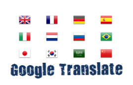
اضافة اداة ترجمة جوجل بالاعلام للمواقع

https://blogger.googleusercontent.com/img/b/R29vZ2xl/AVvXsEhaskHIhv4kGoD1TtdPHwNuPAOmNv32DbgRZv51rZCKFWpo55U7e8jJ_BRZ_zuymyvmLUq0JUW0bCPBLaEkMig6837gZMG3M3fRY8BFCQ4Ddqo2UIy0cMOYThyVnUX9N1UnaczDuW5ywZu3/s1600/google+translate+widget.png 

السلام عليكم!يسعدني ان اقدم لكم اداه جميله لترجمه الصفحه

عبر ترجمة جوجل بشكل انيق و اسهل في الاستخدام فكما ترا في الصورة اعلاه 

يمكنك اختيار اللغه بواسطة علم الدوله المصدر بلوجر هيلب اتمنى ان تعجبكم الاضافه الان

مع كيفية التركيب:

  1. اذهب للوحة تحكم مدونتك.
  2. تخطيط.
  3. اضف اداة " HTML/JavaScript"
  4. الصق الكود التالي بداخلها.
<script type="text/javascript">

function showHide(shID) {

if (document.getElementById(shID)) {

if (document.getElementById(shID+'-show').style.display != 'none') {

document.getElementById(shID+'-show').style.display = 'none';

document.getElementById(shID).style.display = 'block';

}

else {

document.getElementById(shID+'-show').style.display = 'inline';

document.getElementById(shID).style.display = 'none';

}

}

}

</script>


<style>


.google_translate img {

margin: 10px 20px 0px 20px;

height: 24px;

width: 24px;

}

.google_translate:hover img {

filter:alpha(opacity=0.30);

-moz-opacity: 0.30;

opacity: 0.30;

border:0;

}


.more {

display: none;

a.showLink, a.hideLink {

text-decoration: none;

color: #0880C4;

padding-left: 18px;

background: transparent('down.gif') no-repeat left; }


a.hideLink {

background: transparent url('up.gif') no-repeat left;

color: #0880C4;}


a.showLink:hover, a.hideLink:hover {

color: #0880C4;

}


</style>


<div>


<a class="google_translate" href="#" target="_blank" rel="nofollow"
title="English"
onclick="window.open('http://translate.google.com/translate?u='+encodeURIComponent(location.href)+'&langpair=auto%7cen&hl=en');
return false;"><img alt="English" border="0" align="absbottom"
title="English" height="24"
src="https://blogger.googleusercontent.com/img/b/R29vZ2xl/AVvXsEhicFE4XwbnX6Nt_waQFrFgitMSkBot92nM4m2zP1yfPfxhBnygKNQ91Fz5AXpfdA9dTt8uOOzCKlrm_om1G1SHVNYG0IeDuGSieUASDgY6IJ7uLgowaTU-M8DA3qoPYIy5PTWjnfFr0tq2/s1600/United+Kingdom(Great+Britain).png"
style="cursor: pointer;margin-right:8px" width="24"/></a>


<a class="google_translate" href="#" target="_blank" rel="nofollow"
title="French"
onclick="window.open('http://translate.google.com/translate?u='+encodeURIComponent(location.href)+'&langpair=auto%7cfr&hl=en');
return false;"><img alt="French" border="0" align="absbottom"
title="French" height="24"
src="https://blogger.googleusercontent.com/img/b/R29vZ2xl/AVvXsEhcsl8K-21mMhgAF_Ce6fuj5D76ErrFBXyxiUxJiYCJKgoyJDNO1hyefZpH6ixUXYYU0ik3tkTTx5JmO8v2UMjOceozchcdslV_oQ-tgBDKKF0BsovvXB0-qR6hyEkYQVBk5ErHqa7NlNjl/s1600/France.png"
style="cursor: pointer;margin-right:8px" width="24"/></a>


<a class="google_translate" href="#" target="_blank" rel="nofollow"
title="German"
onclick="window.open('http://translate.google.com/translate?u='+encodeURIComponent(location.href)+'&langpair=auto%7cde&hl=en');
return false;"><img alt="German" border="0" align="absbottom"
title="German" height="24"
src="https://blogger.googleusercontent.com/img/b/R29vZ2xl/AVvXsEh6Ou-yY7GLfV9y9DZcg0jgR_q2oKl13TGuIDv1hi6ZqNY0ZSrFKxkmR5a1HShYzn1-0-2q5HQxX3vX13x6mJ7vvMHmEhHlNosTRW4RXUhP1_tDQWSKTV3TSZ_D3XNJop4AJHrrvNxrQeJ3/s1600/Germany.png"
style="cursor: pointer;margin-right:8px" width="24"/></a>


<a class="google_translate" href="#" target="_blank" rel="nofollow"
title="Spain"
onclick="window.open('http://translate.google.com/translate?u='+encodeURIComponent(location.href)+'&langpair=auto%7ces&hl=en');
return false;"><img alt="Spain" border="0" align="absbottom"
title="Spain" height="24"
src="https://blogger.googleusercontent.com/img/b/R29vZ2xl/AVvXsEg9gJd0NbuXLIADQKw2Gkaek_KHHtZJO-cdL65X8LMM9MJMXwDZaVMky-CP1Fn4MbFfXafjAoLsOC9IaqKbL5P4rardE3unw-zDIW497fBgKvHico8k1VgUUd3Op3XniJqSApXvrZGVaR0e/s1600/Spain.png"
style="cursor: pointer;margin-right:8px" width="24"/></a><a
href="#" id="example-show" class="showLink"

onclick="showHide('example');return false;">More

<div id="example" class="more">

<a class="google_translate" href="#" target="_blank" rel="nofollow"
title="Italian"
onclick="window.open('http://translate.google.com/translate?u='+encodeURIComponent(location.href)+'&langpair=auto%7cit&hl=en');
return false;"><img alt="Italian" border="0" align="absbottom"
title="Italian" height="24"
src="https://blogger.googleusercontent.com/img/b/R29vZ2xl/AVvXsEjCzKfNMeY3IrDTiHFy7isgMOieyTWaCAWWvgyA95zIUTxorr7EicPZpca86iSB0awhk7GsfSP_eWCjBRKDER-TD-JMTabXBxsXSsreNgRXngNleWLIW_mws4uif1JPPBWuESEz2yZcF2GD/s1600/Italy.png"
style="cursor: pointer;margin-right:8px" width="24"/></a>


<a class="google_translate" href="#" target="_blank" rel="nofollow"
title="Dutch"
onclick="window.open('http://translate.google.com/translate?u='+encodeURIComponent(location.href)+'&langpair=auto%7cnl&hl=en');
return false;"><img alt="Dutch" border="0" align="absbottom"
title="Dutch" height="24"
src="https://blogger.googleusercontent.com/img/b/R29vZ2xl/AVvXsEgh15L6u9BYT-1Hl_4-lyJBYBDc3auRDi56MtWMnJRHrEJrmNi_FftkN47BUPOUA4Z4KcWyxnGsam1ubjAVnFltO-iPrhnzzpnDmkZKUhpE9fivfIYsUDBmsVbU1qqwmePPsvc811sawiO1/s1600/Netherlands.png"
style="cursor: pointer;margin-right:8px" width="24"/></a>

<a class="google_translate" href="#" target="_blank"
rel="nofollow" title="Russian"
onclick="window.open('http://translate.google.com/translate?u='+encodeURIComponent(location.href)+'&langpair=auto%7cru&hl=en');
return false;"><img alt="Russian" border="0" align="absbottom"
title="Russian" height="24"
src="https://blogger.googleusercontent.com/img/b/R29vZ2xl/AVvXsEg6MYJA0r2h7oSqmLPIYZJPkehfcyMV8VJVWvCe1NHLf0dGpxrcP3kCy31ly7nMway6tiHPh1hUF6isnL1vXJsCXoFAsIaBf5qeBFB-8UdpqXDxntIPXcWZ1QkW0etAMA5SuKUIBsUTc9uL/s1600/Russian+Federation.png"
style="cursor: pointer;margin-right:8px" width="24"/></a>


<a class="google_translate" href="#" target="_blank" rel="nofollow"
title="Portuguese"
onclick="window.open('http://translate.google.com/translate?u='+encodeURIComponent(location.href)+'&langpair=auto%7cpt&hl=en');
return false;"><img alt="Portuguese" border="0" align="absbottom"
title="Portuguese" height="24"
src="https://blogger.googleusercontent.com/img/b/R29vZ2xl/AVvXsEiAQcR-K6Cm_JyxF5lwhhnhBOc6vIwpUIyf4Q-eazBmzzeMkxgy3A11sIjc0ZnYX0eoG_1AfJqXqGnFixe4Xv0OdM3SH1pOCqOL-eIWlDfU62sJR31P0Fg8axXuBfOkeg6cA_V1hgf1Oc8a/s1600/Brazil.png"
style="cursor: pointer;margin-right:8px" width="24"/></a>

<br />

<a class="google_translate" href="#" target="_blank" rel="nofollow"
title="Japanese"
onclick="window.open('http://translate.google.com/translate?u='+encodeURIComponent(location.href)+'&langpair=auto%7cja&hl=en');
return false;"><img alt="Japanese" border="0" align="absbottom"
title="Japanese" height="24"
src="https://blogger.googleusercontent.com/img/b/R29vZ2xl/AVvXsEgGw7tTEaI7UQ-U354meKJSYge370qnsFz4KdBaHhky6kZ2C6rTc9DQLvw_erYQpdrjcP5jUFeksGnKFgVkWn9ZEt20kYsLSLVuNXg9YeN1rrZwE2ilsqx1Dw-YMyspbgWHubLVmKpstmfv/s1600/Japan.png"
style="cursor: pointer;margin-right:8px" width="24"/></a>


<a class="google_translate" href="#" target="_blank" rel="nofollow"
title="Korean"
onclick="window.open('http://translate.google.com/translate?u='+encodeURIComponent(location.href)+'&langpair=auto%7cko&hl=en');
return false;"><img alt="Korean" border="0" align="absbottom"
title="Korean" height="24"
src="https://blogger.googleusercontent.com/img/b/R29vZ2xl/AVvXsEhSTcFjPOmOlzy_v33iE9Sp7oFF0KOepV30J48sHph3PgWpKJQCO4aS1NNvE5__CQpTlAb0Sq1ReUGck6jbXl4SYMf474FxtOvMRhyV20uI3y9hjLuJ6Vh8xMa43IH8mCE_WecsK0riFWWB/s1600/South+Korea.png"
style="cursor: pointer;margin-right:8px" width="24"/></a>


<a class="google_translate" href="#" target="_blank" rel="nofollow"
title="Arabic"
onclick="window.open('http://translate.google.com/translate?u='+encodeURIComponent(location.href)+'&langpair=auto%7car&hl=en');
return false;"><img alt="Arabic" border="0" align="absbottom"
title="Arabic" height="24"
src="https://blogger.googleusercontent.com/img/b/R29vZ2xl/AVvXsEjqlgLsdZgRQ8QPFYgD6r-B3DnoJfqRlaB00ZBs9JsurTer0nUYAq49yZlx0s_HbJW1MtPI_gc61u5vyrZM3G7nAW29ZnMuCOoHeodsR5c3kcsL7D0WVjEZCtFWocCVp6kHAc27FPHDclSf/s1600/Saudi+Arabia.png"
style="cursor: pointer;margin-right:8px" width="24"/></a>


<a class="google_translate" href="#" target="_blank" rel="nofollow"
title="Chinese Simplified"
onclick="window.open('http://translate.google.com/translate?u='+encodeURIComponent(location.href)+'&langpair=auto%7czh-cn&hl=en');
return false;"><img alt="Chinese Simplified" border="0"
align="absbottom" title="Chinese Simplified" height="24"
src="https://blogger.googleusercontent.com/img/b/R29vZ2xl/AVvXsEgjC3WYSKYv6KknOXTZQwSSeXEUCfTlpBYSJ21wto6TLYkKxzjEB_Za4Ld6cA00JbdlqTm1FpKqiqqhi_WPH5dra-u1IfE6W0iBNgoBFUFevpoWCPf0qvd_1tFKdFdhgKPdbVxWhhCQUBtl/s1600/China.png"
style="cursor: pointer;margin-right:8px" width="24"/></a>

<p><a href="#" id="example-hide" class="hideLink"

onclick="showHide('example');return false;">Hide /
</a><a href="www.blogger-archive.com"><font
size="1px">أحصل على مثل هذه الاضافه</font></a></p>

</div>

</a
></div>
  الان اضغط حفظ.

:::::::::::::::::::::::::::::::::::::::::::::::::::::::::::::::::::::
اخيراً اذا اعجبك الموضوع او استفدت منه  شاركني برأيك

ولو بكلمة شكر ولا تنسى الضغط على ازرار المواقع الاجتماعية ادناه.
تحياتي.


كيفية اضافة قائمه جانبية انيقة لبلوجر , الورد برس

https://blogger.googleusercontent.com/img/b/R29vZ2xl/AVvXsEip0csmj3jvmmH2QD62QT6l9T4zqIT7qD82_9k-ofwYXUaWK8FfbmNNFBpCDm6RmNSYKc4MqAgUDt5jJ8crnFVZuC6wjcBXSkh4ig9fNWtxYQKulAHVuAIq8q3q56RsyzlIUKgs0cIB_UP7/s1600/Css3-Vertical-Side-menu.JPG 
السلام عليكم!اقدم لكم اضافة جميله و انيقه للمدونات وهي عبارة عن
قائمة جانبيه تحوي التبويبات التاليه:
الرئيسيه , حول الموقع, الاقسام,شروط الخصوصيه,الاتصال بنا.

الان لكيفية التركيب:

  1. اذهب للوحة تحكم مدونتك.
  2. القالب,
  3. تحريرHTML
  4. اشر على توسيع القوالب.
  5. اضغط Ctrl+F من لوحة المفاتيح.
  6. ابحث عن الوسم التالي:
 ]]></b:skin>


 والصق قبلة مباشره الكود التالي:


<!-- Start Shareaholic Sassy Bookmarks HTML Bloggertrix.com-->#hor {
list-style:none;
padding:0;
margin:0;}
#hor li {
float:left;
padding:5px;}
#hor a {
display:block;
height: 12px;
text-indent:-999em;}
#hor a.home {
width:46px;
background:url(vHome.gif) no-repeat 0 0;}
#hor a.download {
width:94px;
background:url(vDownload.gif) no-repeat 0 0;}
#hor a.contact {
width:74px;
background:url(vContact.gif) no-repeat 0 0;}
/* CSS Style for Vertical Menu */

#ver {
list-style:none;
padding:0;
margin:0;
}
#ver li {
padding:2px;}

#ver li a {
display:block;
height:12px;
text-indent:-999em;
}
#ver a.home {
width:47px;
background:url(hHome.gif) no-repeat 0 0;
}

#ver a.download {
width:95px;
background:url(hDownload.gif) no-repeat 0 0;
}

#ver a.contact {
width:74px;
background:url(hContact.gif) no-repeat 0 0;
}


.clear {
clear:both;
}


*{
/* A universal CSS reset */
margin:0;
padding:0;
}


#navigationMenu body{
font-size:14px;
color:#666;
background:#111 no-repeat;


/* CSS3 Radial Gradients */
background-image:-moz-radial-gradient(center -100px 45deg, circle farthest-corner, #444 150px, #111 300px);
background-image:-webkit-gradient(radial, 50% 0, 150, 50% 0, 300, from(#444), to(#111));

font-family:Arial, Helvetica, sans-serif;
}

#navigationMenu li{
list-style:none;
height:39px;
padding:2px;
width:40px;
}

#navigationMenu span{
/* Container properties */
width:0;
left:38px;
padding:0;
position:absolute;
overflow:hidden;

/* Text properties */
font-family:'Myriad Pro',Arial, Helvetica, sans-serif;
font-size:18px;
font-weight:bold;
letter-spacing:0.6px;
white-space:nowrap;
line-height:39px;

/* CSS3 Transition: */
-webkit-transition: 0.25s;

/* Future proofing (these do not work yet): */
-moz-transition: 0.25s;
transition: 0.25s;
}

#navigationMenu a{
background:url('https://blogger.googleusercontent.com/img/b/R29vZ2xl/AVvXsEie6fZXVQ7y65Wh0JvXkYS4y8UOrctuN-vlYzGWYsrZ2uuJ7Rz9uhlbtq691vtf00jILmUHfrXvZMGFhPwg7EF0nlqPECYeJTbk8DqbMyHFVqiaSORrg93aJDGz1uwg-MJS1S7lHOtK-nn1/s1600/navigation.jpg') no-repeat;

height:39px;
width:38px;
display:block;
position:relative;
}

/* General hover styles */

#navigationMenu a:hover span{ width:auto; padding:0 20px;overflow:visible; }
#navigationMenu a:hover{
text-decoration:none;

/* CSS outer glow with the box-shadow property */
-moz-box-shadow:0 0 5px #9ddff5;
-webkit-box-shadow:0 0 5px #9ddff5;
box-shadow:0 0 5px #9ddff5;
}

/* Green Button */

#navigationMenu .home { background-position:0 0;}
#navigationMenu .home:hover { background-position:0 -39px;}
#navigationMenu .home span{
background-color:#7da315;
color:#3d4f0c;
text-shadow:1px 1px 0 #99bf31;
}

/* Blue Button */

#navigationMenu .about { background-position:-38px 0;}
#navigationMenu .about:hover { background-position:-38px -39px;}
#navigationMenu .about span{
background-color:#1e8bb4;
color:#223a44;
text-shadow:1px 1px 0 #44a8d0;
}

/* Orange Button */

#navigationMenu .services { background-position:-76px 0;}
#navigationMenu .services:hover { background-position:-76px -39px;}
#navigationMenu .services span{
background-color:#c86c1f;
color:#5a3517;
text-shadow:1px 1px 0 #d28344;
}

/* Yellow Button */

#navigationMenu .portfolio { background-position:-114px 0;}
#navigationMenu .portfolio:hover{ background-position:-114px -39px;}
#navigationMenu .portfolio span{
background-color:#d0a525;
color:#604e18;
text-shadow:1px 1px 0 #d8b54b;
}

/* Purple Button */

#navigationMenu .contact { background-position:-152px 0;}
#navigationMenu .contact:hover { background-position:-152px -39px;}
#navigationMenu .contact span{
background-color:#af1e83;
color:#460f35;
text-shadow:1px 1px 0 #d244a6;
}

  1.  الان اذهب إلى تخطيط.
  2. اضف اداة  'HTML/Javascript
  3.  و الصق الكود التالي:

<div style='position: fixed; top: 40%; left: 0%;'/>
<ul id="navigationMenu">
<li>
<a class="Home" href="اضف رابط الصفحة الرائيسيه">
<span>الرائيسيه</span>
</a>
</li>
<li>
<a class="about" href="اصف رابط صفحة حول الموقع">
<span>حول الموقع</span>
</a>
</li>
<li>
<a class="categories" href="اضف رابط صفحة الاقسام">
<span>الاقسام</span>
</a>
</li>
<li>
<a class="services" href="اضف رابط صفحة حفظ الحقوق">
<span>حفظ الحقوق</span>
</a>
</li>
<li>
<a class="contact" href="اضف رابط صفحة الاتصال بنا">
<span>الاتصال بنا</span>
</a>
</li>
</ul>
</div>
 عدل الروابط في الكود ثم اضغط حفظ.


:::::::::::::::::::::::::::::::::::::::::::::::::::::::::::::::::::::::::::

اخيراً اذا اعجبك الموضوع او استفدت منه  شاركني برأيك
ولو بكلمة شكر ولا تنسى الضغط على ازرار المواقع الاجتماعية ادناه.
تحياتي.


المصدر:بلوجر تيراكس

اضافة ازرار المواقع الاجتماعيه عائمه بشكل جميل جدا للمواقع و المدونات

https://blogger.googleusercontent.com/img/b/R29vZ2xl/AVvXsEjb5wBGSBlkfGYYprO-V3mK7sX-Z6go7ShdLLweFYT81X2eyAHqZBumhcD0p6SNNDN1ZuK4RryjiVDE9s2tMlgnCKMM3SeR-AYPi0jaOwbAILnEiTU1NfiKCI1dbRFshQHc-Y4eEAPIx1A/s1600/Shareaholic+Sassy+Sharing+Widget+For+Blogger.jpg 

السلام عليكم!اقدم لكم اليوم اضافة انيقه وهيكما ترى في الصوره اعلاه

فعندما يحرك المؤشر فوق هذه الدائرة الخضراء يخرج منها بشكل

تلقائي مجموعه من ايقونات المواقع الاجتماعيه وعن 

النقر على احداها تفتح صفحة مشاركه الموضوع 

في ذلك الموقع الاجتماعي تم اخذ

كود الاضافة منن مدونة بلوجر تيراكس

فشكرا له الان اترككم مع كيفية التركيب:
  1. اذهب للوحة تحكم مدونتك .
  2. تخطيط.
  3. اضف اداه 'HTML/Javascript'
  4.  انسخ فيها الكود التالي :

<!-- Start Shareaholic Sassy Bookmarks HTML Bloggertrix.com-->
<div class="shr_ss shr_publisher"></div>
<!-- End Shareaholic Sassy Bookmarks HTML
<!-- Start Shareaholic Sassy Bookmarks settings -->
<script type="text/javascript">
var SHRSS_Settings = {"shr_ss":{"src":"//dtym7iokkjlif
.cloudfront.net/media/downloads/sassybookmark","link":"",
"service":"5,7,2,313,38,201,88,74","apikey":
"b87f5899d80a5edce8b5e55f58542ef0f","localize":
true,"shortener":"bitly","shortener_key":"",
"designer_toolTips":true,"tip_bg_color":"black",
"tip_text_color":"white","viewport":true,
"twitter_template":"${title} - ${short_link} via @Shareaholic"}};
</script>
<!-- End Shareaholic Sassy Bookmarks settings -->
<!-- Start Shareaholic Sassy Bookmarks script -->
<script type="text/javascript">
(function() {
var sb = document.createElement("script"); sb.type = "text/javascript";sb.async = true;
sb.src = ("https:" == document.location.protocol ? "https://dtym7iokkjlif.cloudfront.net" : "http://cdn.shareaholic.com") + "/media/js/jquery.shareaholic-publishers-ss.min.js";
var s = document.getElementsByTagName("script")[0]; s.parentNode.insertBefore(sb, s);
})();
</script>

<!-- End Shareaholic Sassy Bookmarks script Bloggertrix.com -->

الان اضغط حفظ.
:::::::::::::::::::::::::::::::::::::::::::::::::::::::::::::::::::::::::::

اخيراً اذا اعجبك الموضوع او استفدت منه  شاركني برأيك
ولو بكلمة شكر ولا تنسى الضغط على ازرار المواقع الاجتماعية ادناه.
تحياتي.